The Artist and his work
Artem Paramonov is Senior 3D Creative at Iris Worldwide in Singapore. He is currently working in the advertising industry, focusing on TV branding, film post-production, product visualization, animation and motion design.
Tim mainly uses Maya, Maxwell Render, Mental Ray, HDR Light Studio, After Effects, RealFlow, Photoshop and Final Cut.
He has a background in photography and cinematography. At the time he studied at the Moscow International Film School they used analogue cameras and manually processed the film. 3D came later! In addition, Tim is a TV and Radio Institute of Humanities graduate, so he is rather familiar with the way that light flows, and how shadows are formed. He considers his background to have helped him a lot in his current career focus.
You can visit his website and his Vimeo account to see more projects.
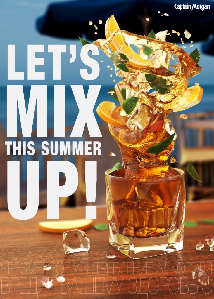
One of Tim´s most recent projects is Mix Swirl with Maxwell Render and RealFlow that he did as an Art Director at The Market Group in Moscow, Russia. We asked him to share his experience with us on this rather summery project, as well as some useful rendering tips. Thank you, Tim!
Maxwell Render & RealFlow
It was an awesome experience using Maxwell and RealFlow together! Super straightforward and predictive.
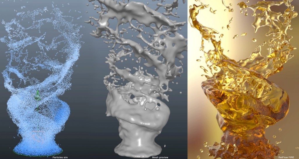
I started with RealFlow, naturally. I was really inspired by the way liquid could have a personality. I guess every product has a certain look or character, and it really felt like this with the liquids I was making.
MAKING OF
Concept and objective
The idea was to show that a simple rum glass is no longer enough, and the project also had to have a summer feel. I wanted to show that rum itself can be more than just a straight-up drink. So it jumps out of a classic glass with swirling ice, oranges and mint.
Modeling
The table was first. I like to model the ground plane to get an impression of how it potentially could look at the end. So the table was just a simple plane with texture. Maxwell Render did all the magic. Then I created a glass, big ice cubes, mint leaf and a slice of a citrus (I was not sure about the fruit, so it was just for reference at first). And, my favorite part was when I jumped into RealFlow. Creating graphs in the new version is so much fun. It’s pretty much like playing with the laws of physics. I’m really enjoying it. Once I was happy with the result, I brought everything back to Maya. So I had a table, a glass and an awesome liquid swirl mesh. It became obvious that I needed more ice, more mint leaves and more slices of orange. So I shuttered a couple of ice cubes to spread them around as if they were smashed with force. I spread some leaves and slices of orange around. And I guess that’s it!

Materials/Textures
The materials are super simple. The liquid is just a “liquid” with attenuation tint. The mint leaves are bent planes with an alpha map. The oranges – half a cylinder with textures. Everything was fairly simple.
Environmental touches
I used an HDRI map for the environment, basically some orange, yellow and brown blurry stuff.
Camera
Aperture priority setting. 50 mm. Nothing fancy. The only thing I wanted to control was the amount of DOF on post production, so I used a pinhole camera with a z-depth pass.

Render setup
I needed an A4 x 300 dpi. I rendered everything (master render + object ID + z-depth) on my Mac Pro overnight and I set up a 360 turntable to render over the weekend (I was not in a rush with this).
Post Production
The post production for the print version was done in Photoshop. I just added DOF using z-depth pass. I did some color correction to match the background image. The 360 turntable was slightly color-corrected in After Effects. And that’s it!

Software
Maya, RealFlow, Maxwell Render, Photoshop, After Effects.
Hardware
Mac Pro, 3,5 GHz 6-Core Intel Xeon E5, 16 GB RAM.
TOP 5 Rendering Tips
#1. Progressive rendering
Extremely useful, not only for animations, but for stills also. When I need to do a couple of versions of the same image I simply use progressive rendering. So, if you set up your render overnight – you can easily get two or three images done to a pretty high SL.
#2. Optimized Materials
If you want to cut the render time of your images, you need to simplify your materials. The rule of thumb is to go as simple as possible. Just cut down everything you don’t need. What I found useful is when you use an image mask to create, let´s say, a glossy logo on a white matte paper, is to then use the same (or slightly modified) image for global bump to support the difference between those two.
#3. HDRI + Lights
I’m a big fan of HDR maps. I use them all the time. However, I found it very handy to use the HDR image + the light emitter. HDR image alone would not always give you those sharp shadows or unique reflections, like light (with proper emitter settings) would do. And it’s easy to turn over. In some cases I use an HDR map I’ve created for another project – for just general reflections and lighting – and Area (or spot) lights to highlight whatever I need in my current project. This saves you a lot of time when you have tight deadlines.
#4. Camera settings
We all get into that trap when you start messing with the camera settings and your render is still dark or blurry, or there is just something wrong with it. What I like to do (especially when I don’t really have much time) is to use “Aperture priority” mode. And don’t think about shutter speed. Just focus on F number and the film sensitivity. It is super easy to set up perfect camera settings for bright and sharp renders.
#5. Glossy floor
Okay, this one was not used in this project, but I just find it really useful. You know, sometimes, we all need those nasty product renderings with the glossy reflections. And we all know that if we use a plane with a chrome material for example – we can achieve this. But we’ll also get these reflections everywhere the plane goes. The plane will also block lights and make your renders look darker at the bottom. So when I need those kinds of glossy reflections I go a bit old-school. I create a black and white image of a circle (mostly, although it depends on the project) with blurry edges, and I use it as a layer mask for the plane’s material. This way you get your reflections, but only under the product itself, with a smooth transition. It is easy to compose to white backgrounds and, basically, to anything.